01 — THE MARK
Logo & Lockups
The winged “F” in a struck disc is the heart of the brand. Use the full stacked lockup wherever space allows; drop to the icon alone for avatars, favicons, embroidery and stamps.
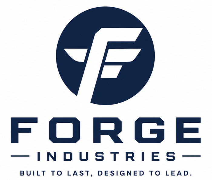
 ICON · ON NAVY
ICON · ON LIGHT
ICON · ON CREAM
ICON · ON NAVY
ICON · ON LIGHT
ICON · ON CREAM
CLEAR SPACE
Keep margin equal to the height of the disc on all sides. Minimum icon size: 24 px digital / 10 mm print.
Don't recolor the mark outside navy / cream / white.
Don't stretch, rotate or skew the lockup.
Don't add shadows, gradients or outlines.
Don't place the navy mark on a busy or low-contrast photo.
02 — PALETTE
Color
Deep navy carries the brand; warm cream keeps it human and premium. Everything else is structural — ink for type, steel for secondary copy, paper for surfaces.
03 — TYPE
Typography
A squared, technical display face echoes the wordmark; a clean humanist sans keeps long copy readable across languages and labels.
Saira
DISPLAY · HEADLINES
Forge
ABCDEFGHIJKLM · 0123456789
Barlow
BODY · INTERFACE
Workwear and leather goods, manufactured to specification and shipped to ports worldwide.
Regular · Medium · SemiBold
04 — IN THE WILD
Applications
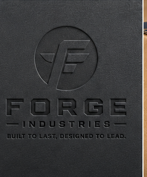
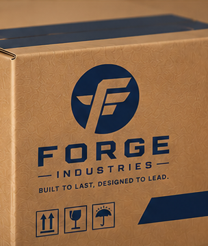
The identity is built to survive every surface it ships on — thread, ink, deboss, corrugate.
Forge Corporation
BUILT TO LAST, DESIGNED TO LEAD.
Importer, exporter & manufacturer of workwear, gloves and safety gear. Karachi, Pakistan.
GET IN TOUCH
export@forgecorpglobal.com+92 301 030 7729WhatsApp us →Plot No 436, Street 6, Akhtar Colony,
Korangi Road, Karachi, Pakistan
Korangi Road, Karachi, Pakistan
© 2026 FORGE CORPORATION. ALL RIGHTS RESERVED.FOB KARACHI · SHIPPING WORLDWIDE